


Entre em qualquer corredor de snacks de supermercado e vai reparar numa coisa interessante - dezenas de marcas de batatas fritas, muitas vezes com sabores muito semelhantes.
Mas alguns vendem-se mais depressa do que outros.
Porquê?
Por causa do saco.
Um saco de batatas fritas não é apenas um invólucro. É um embaixador silencioso da marca. É o que os clientes vêem primeiro, o que recordam e, muitas vezes, o que os faz comprar.
Em suma, o design da embalagem pode decidir se as suas batatas fritas se destacam - ou passam despercebidas.
Cor, gráficos e a decisão em 7 segundos
A cor tem poder.
A emoção é moldada muito antes de uma pessoa ler o texto.
Os tons quentes como o vermelho, o laranja e o amarelo despertam o apetite e a energia - é por isso que o Lay's e o Oishi os utilizam com tanta frequência.
O verde e o branco sugerem “natural” ou “luz”.”
O preto e o prateado metálico assinalam algo de premium.
Os gráficos contam a história.
A maioria dos compradores não lê as letras miudinhas. Vêem uma imagem - uma batata frita estaladiça, talvez alguns ingredientes - e decidem de imediato.
Algumas marcas são arrojadas e coloridas; outras mantêm o minimalismo para uma vibração moderna e sofisticada.
O design da abertura também conta.
Pequenos pormenores, como entalhes fáceis de abrir ou fechos de correr que podem ser fechados novamente, fazem com que as pessoas se lembrem da marca como “fácil de utilizar”.”
Quando um saco abre de forma limpa e mantém as batatas fritas frescas, cria discretamente a confiança do cliente
E não se esqueça: a maioria dos compradores toma uma decisão sobre um snack em menos de dez segundos.
Se a sua embalagem não lhes chamar a atenção nesse momento, provavelmente não o fará mais tarde.
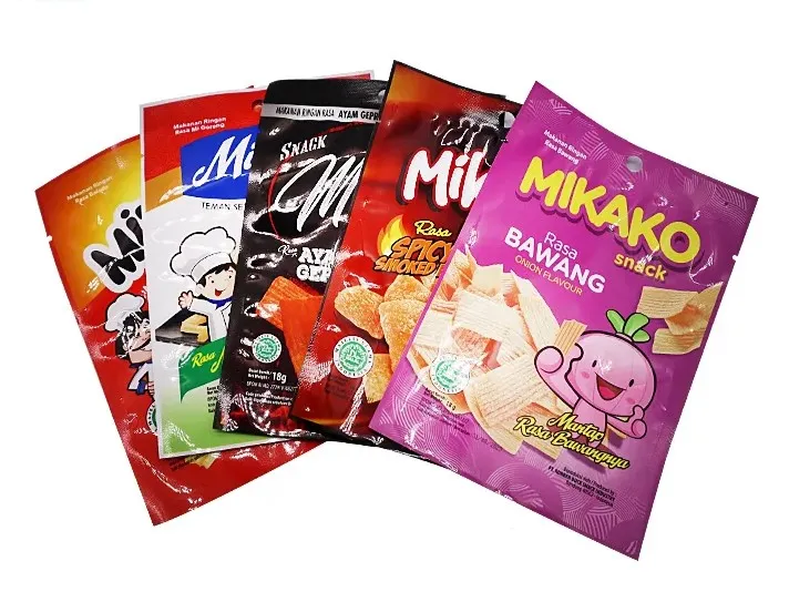
.webp)
-1.webp)
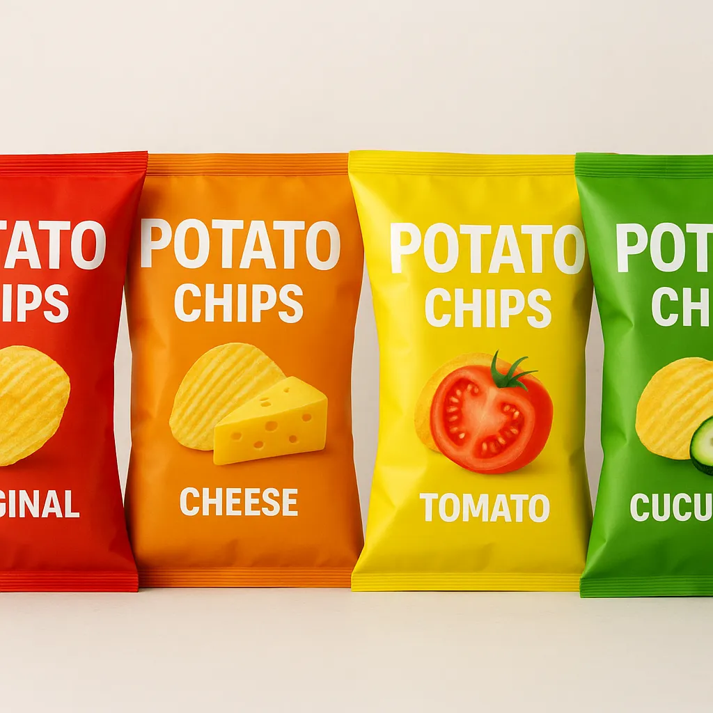
Combinar o visual com o mercado certo
Diferentes linhas de chips falam a diferentes públicos. O design correto estabelece uma ligação direta com esse grupo-alvo.
| Tipo de produto | Estilo | Cores comuns | Película e acabamento |
|---|---|---|---|
| Fichas de qualidade superior | Simples, elegante, limpo | Tons escuros, mate ou metálicos | PET mate / película metalizada |
| Lanches do dia a dia | Brilhante, enérgico | Vermelho, laranja, amarelo | Laminado PET/PE brilhante |
| Produtos para crianças | Lúdico, orientado para as personagens | Contrastes fortes, imagens de banda desenhada | Película PE macia |
| Opções saudáveis | Calmo, natural | Verde, bege, branco | Papel laminado ou película PLA |
Impressão de gravura - Onde a precisão encontra a beleza
Quando se trata de embalagens para snacks, nem todos os métodos de impressão são iguais.
Há flexografia, digital, offset - mas impressão de gravura continua a ser a referência para as marcas que se preocupam com a qualidade visual, a consistência das cores e a fiabilidade da produção.
Porque é que a gravura se destaca
1. Cores profundas e ricas e detalhes nítidos
A impressão de gravura produz tons vibrantes com uma precisão incrível.
Uma vez que a tinta se encontra em células gravadas no cilindro, transfere-se mais uniformemente e cria aquele acabamento profissional de alto brilho que se vê nos sacos de batatas fritas de primeira qualidade.
2. Consistência em grandes volumes
Uma vez fabricados os cilindros, todas as impressões são idênticas.
Isto significa que os seus sacos de batatas fritas têm o mesmo aspeto em todas as expedições - cor, brilho e detalhe consistentes do primeiro ao último rolo.
Para as marcas globais de snacks, este nível de precisão de repetição é fundamental para um forte reconhecimento nas prateleiras.
3. Rápida e eficiente para produção de grandes volumes
As prensas de rotogravura funcionam a alta velocidade sem perder o pormenor.
É ideal para grandes encomendas de snacks em que é necessário desempenho e precisão.
4. Excelente com materiais de película flexível
Quer o substrato seja PET, NY, OPP ou PE, a gravura trata-o sem problemas.
É ideal para estruturas laminadas, efeitos metálicos e acabamentos especiais - caraterísticas que são difíceis de obter com outros métodos de impressão.
5. Qualidade duradoura e aspeto de qualidade superior
As embalagens impressas em gravura resistem ao desvanecimento, têm uma ligação de tinta mais forte e são mais refinadas ao toque.
Essa durabilidade é importante - especialmente para produtos exportados que percorrem longas distâncias ou ficam nas prateleiras das lojas durante meses.
Na nossa fábrica, a impressão de gravuras é mais do que um processo - é um ofício.
Utilizamos prensas multicoloridas de alta precisão, capazes de produzir gradientes ricos, transições suaves e excelente aderência em diferentes películas.
Cada rolo é cuidadosamente verificado quanto ao registo, densidade da tinta e qualidade geral da superfície antes de ser embalado.
Se procura uma embalagem que proporcione imagens nítidas, cores perfeitas e um impacto duradouro, a impressão em rotogravura é o caminho a seguir.
O que as marcas líderes estão a fazer
Lay's
Utiliza um forte bloqueio de cores - vermelho para o clássico, verde para o pepino, azul para as algas marinhas - com um esquema de logótipo simples que é imediatamente reconhecível.
A impressão de gravura brilhante aumenta a frescura e a visibilidade.
Oishi
O design simpático, os tons quentes e os tipos de letra arredondados criam um ambiente alegre e familiar que funciona lindamente para o seu público.
Bestore
Esta marca chinesa aposta em tons mate suaves para promover a sua imagem de “indulgência saudável”.
Alguns dos seus produtos mais recentes já utilizam laminados monomateriais de PE recicláveis - um passo em direção a embalagens mais sustentáveis.
Porque é que o design de embalagens continua a ser o mais importante
Uma boa embalagem não é apenas uma questão de aparência - é uma questão de comunicação e desempenho.
Pode:
- Chama a atenção instantaneamente numa prateleira cheia de gente.
- Conte a história da sua marca antes de alguém ler o rótulo.
- Mantenha as batatas fritas frescas e estaladiças através de melhores camadas de barreira.
- Refletir valores como a sustentabilidade e a qualidade.
Um saco de batatas fritas é mais do que uma proteção - é o primeiro aperto de mão da sua marca.
E quando esse aperto de mão é bom, os clientes lembram-se.
Considerações finais
Os melhores equilíbrios de embalagem aparência, material e mensagem.
É aí que entra um parceiro fiável de embalagens flexíveis.
Na nossa fábrica, concentramo-nos em embalagens de snacks impressas em rotogravura - combinando design visual, tecnologia de barreira e produção eficiente para ajudar as marcas de todo o mundo a fornecer produtos com melhor aspeto e melhor desempenho.
Pronto para atualizar a sua embalagem de batatas fritas?
Vamos falar sobre as suas ideias e criar uma solução que se adapte à sua marca e ao seu orçamento.
👉 Obter um orçamento gratuito | Solicitar amostras